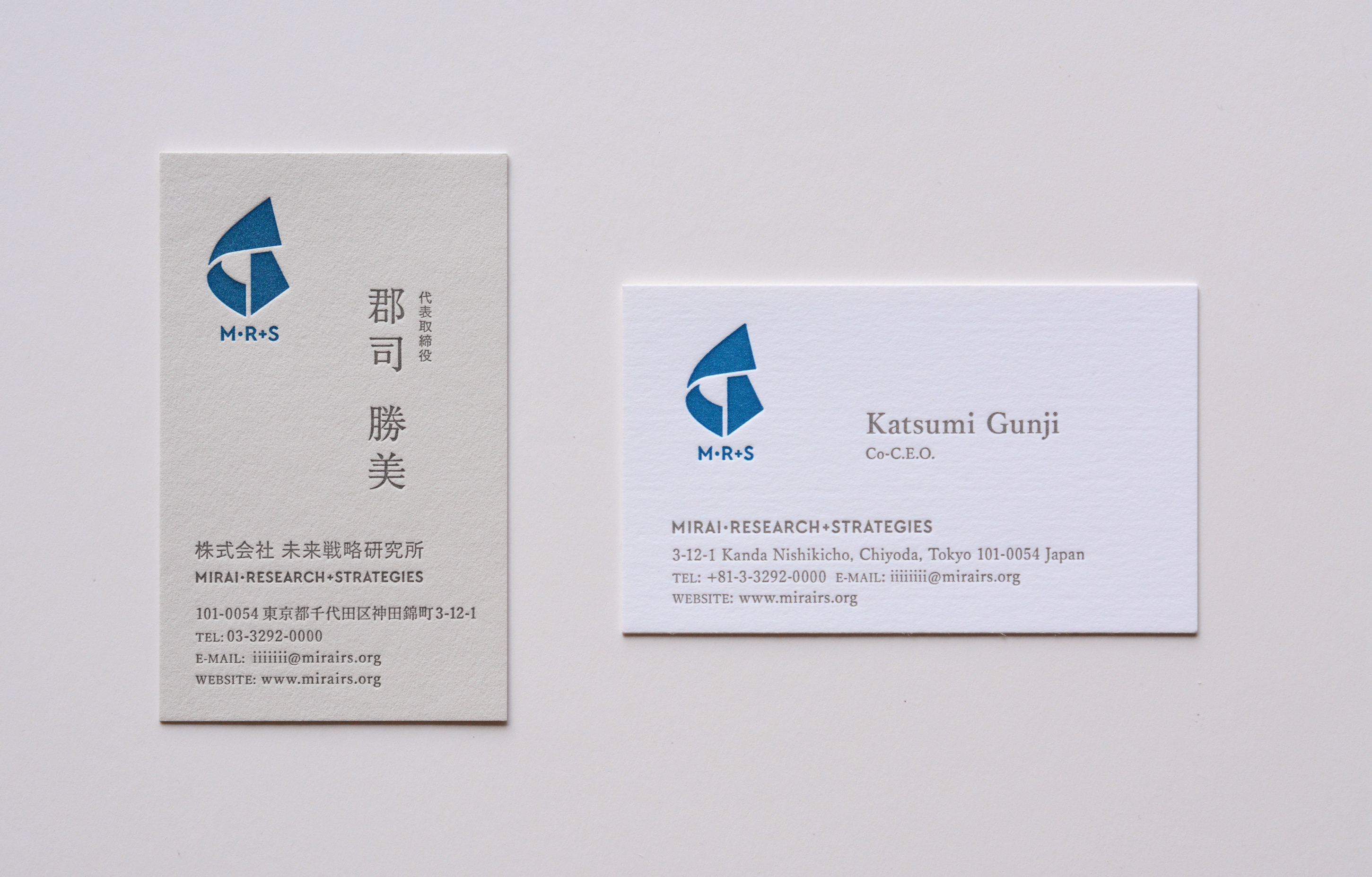
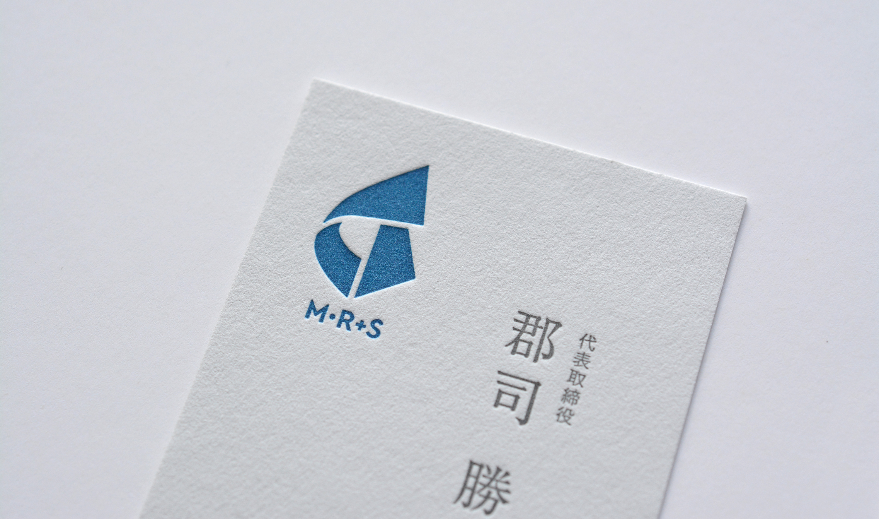
紙業界のトップ3人が設立したシンクタンクのVIデザイン。それぞれの既存ビジネス拡大のためにあらゆる消費者市場を調査・分析するというミッションを体現したシンボルマークをデザイン。
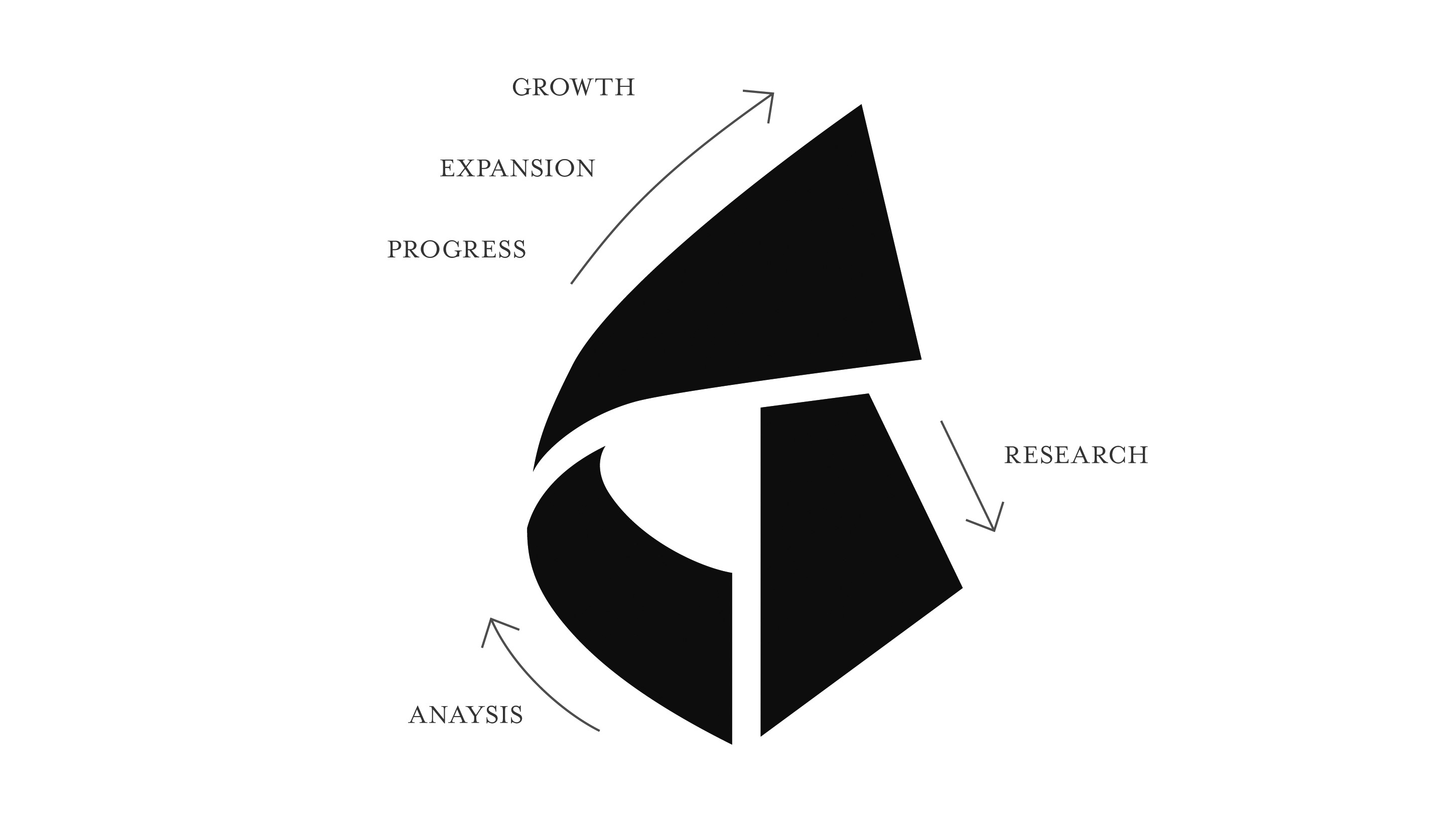
シンボルマークの直線と曲線部分により「サービスや製品の無限性」を表現し、マークの中心から設立目的の「調査、分析・研究」、最終的に「成果・成長・進化」による右上がりでビジネスが拡大していくイメージである。
The goal of this project was to create a visual identity / brand mark for a think-tank organization founded by three top paper industry executives. Their mission is to research and analyze consumer markets in order to identify solutions which will expand their existing businesses.
The brand mark leverages both straight and curved lines to represent the unlimited possibilities of their service and product solutions. The shape with straight lines at the bottom right represents “research from facts”. The shape with curvy the lines at bottom left represents “organic analysis” and the triangle shape at the top represents “progress, expansion and growth” with a positive slope.