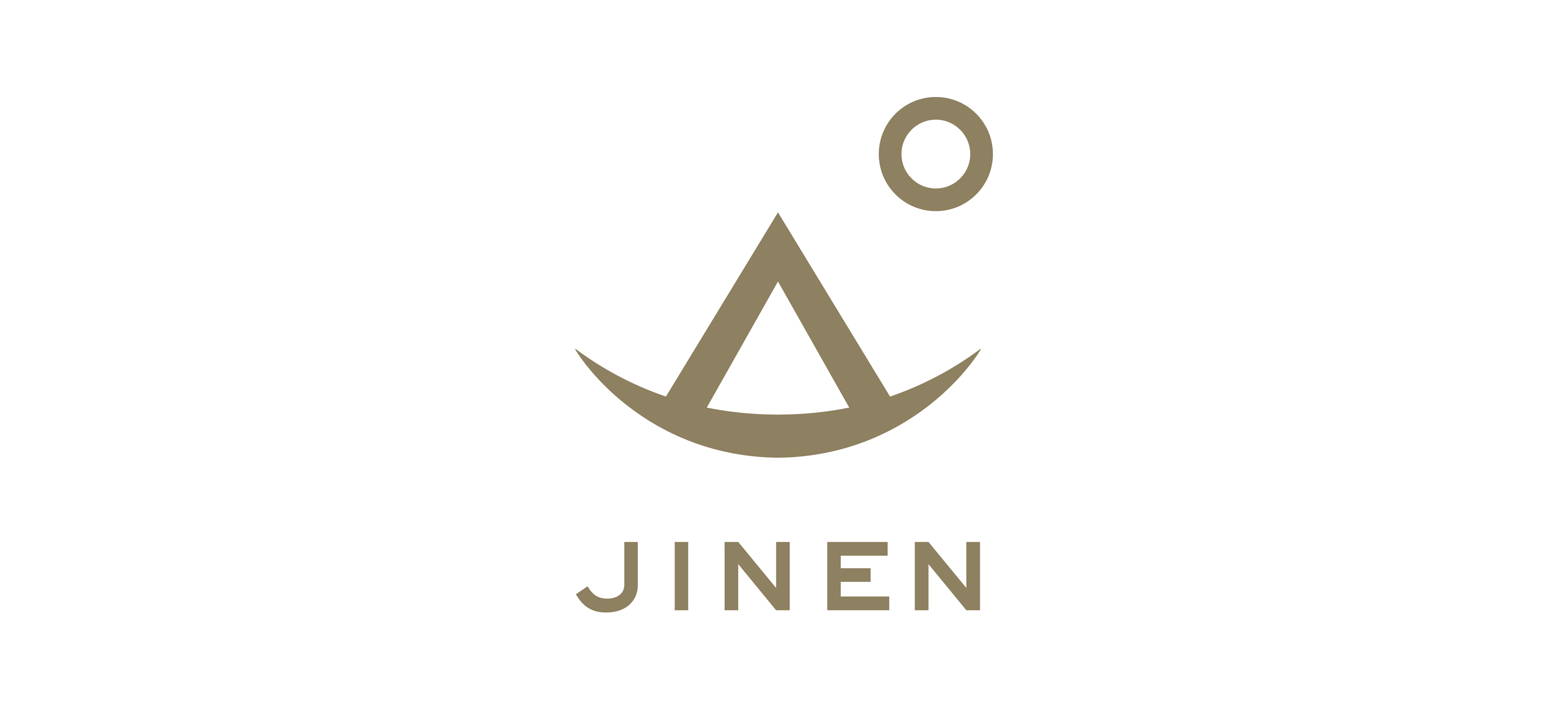
野外で過ごす時間を充実させようという傾向と暮らしに自然を取り入れたいというムードがクロスオーバーするなか、その流れにマッチしたハイクオリティな日本の商品を取り揃えるスタイリッシュでシンプルなオンラインストア「JINEN」のVIデザイン。
自然は人間と対立するものではなく、人間が自然の一部であるという日本的な思想に基づき、シンプルで日本的な繊細さを表現しようと努めた。
シンボルマークの下部は象形文字から発展させた山のかたちが「アウトドア」を、更に家・テントを連想するかたちが「インドア」を表現し、右上の円は太陽、また月を表し「自然」を意味する。シャープな印象のロゴがシンプルで洗練されたJINENの商品コレクションを象徴している。
JINEN is an online retailer which carries high-end Japanese products. JINEN believes that living in harmony with nature enriches our way of life and brings us happiness. JINEN suggests a lifestyle that allows you to feel nature indoors and offers you the comforts of home outdoors.
Most of the written characters in the Japanese language are pictographs, which are symbols for words based on pictures. The lower part of the JINEN logo is a stylized version of the pictograph for “mountain,” which represents the outdoors. In addition, the house or tent-like shape of this pictograph also suggests the indoors. We feel that this design best exemplifies our brand because the products that we carry are geared not only for the outdoors — they are meant to be used whenever and wherever you are. The circle at the top right depicts the sun or the moon, which represent “nature.” The simplicity of the logo embodies the sophistication and elegance of JINEN’s collection.
website: jinenstore.com
Website is designed by Shoko Okano.